


Key Interior Colours for Autumn 2020
Interior Colours for autumn 2020 are driven by the emotional desire for comfort and stability. During times of uncertainty, we all look to the past for reassurance. Nostalgia connects us with familiar vintage and retro colours, providing an opportunity for personalization and authenticity by reinventing and repurposing.
Infuse warmth and calm: give interior a comforting and cosy appeal with warm tones and pigment shades. Muted colourways and cool hues work to create a sense of reassuring calm and hygiene.
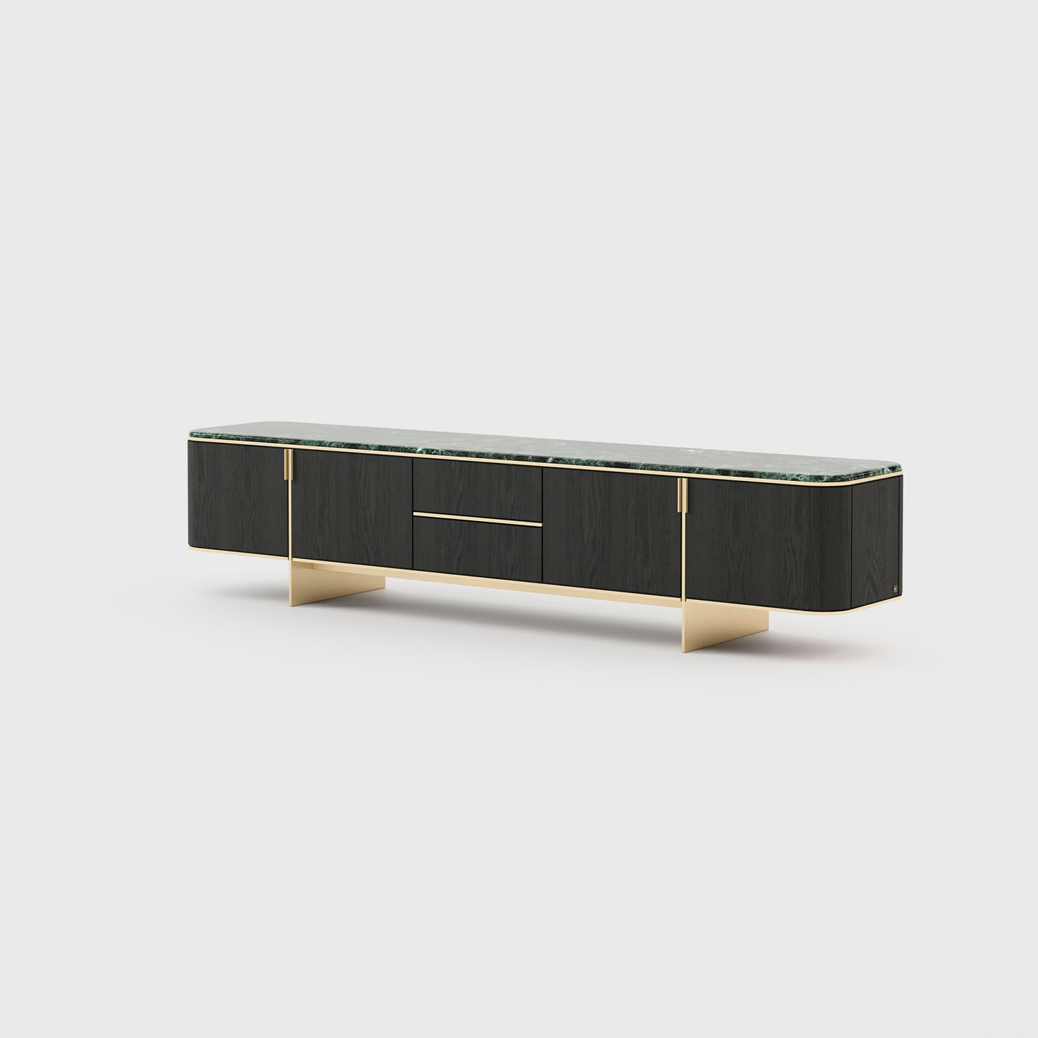
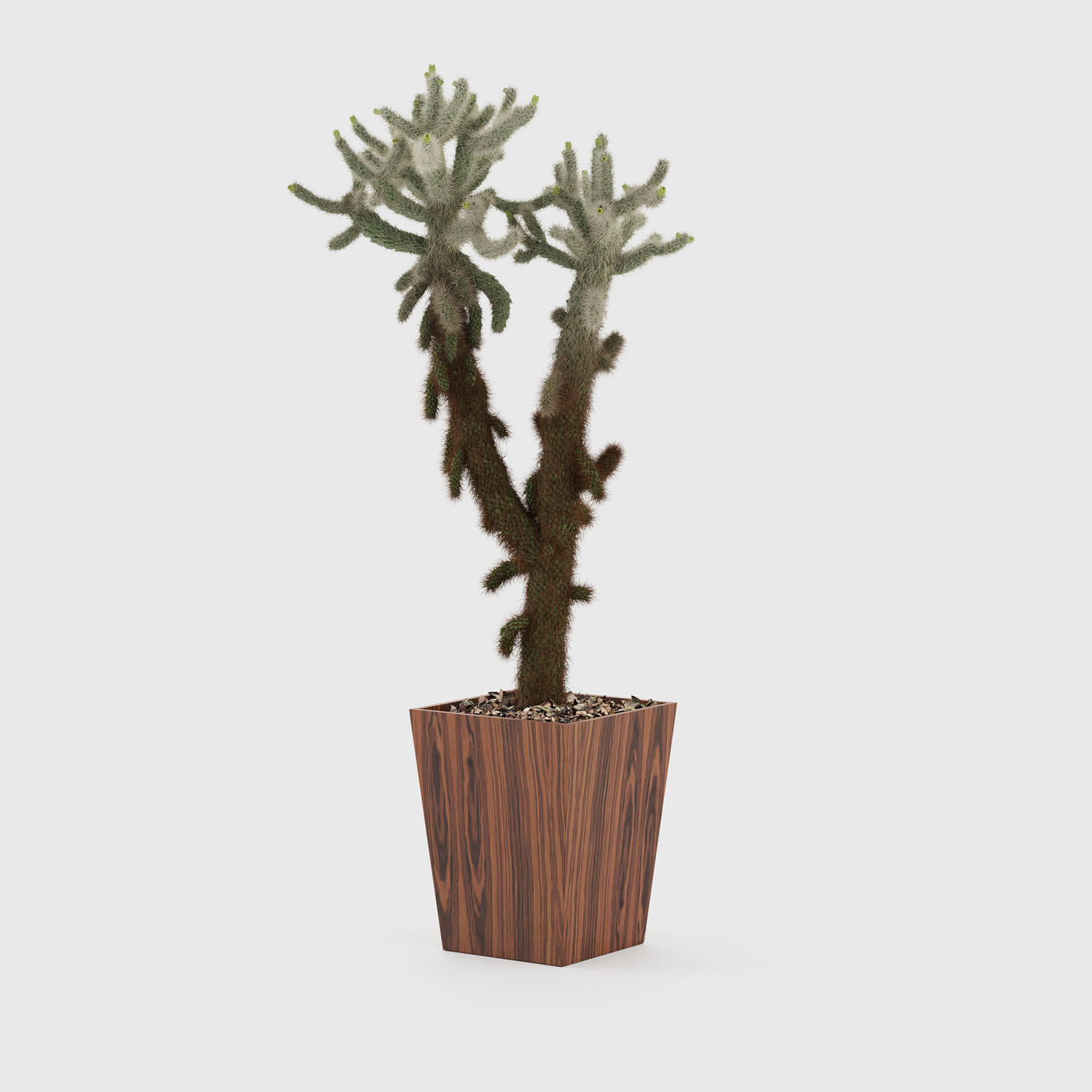
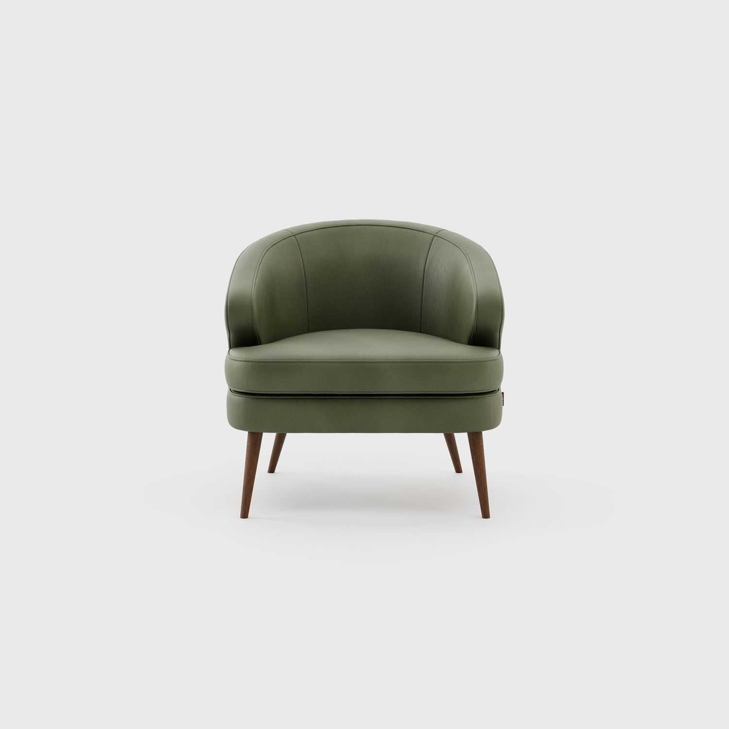
Amazon Green
The importance of green shows no sign of slowing down, with the move towards cooler and darker shades providing a soothing sense of harmony and reassuring calm for hard and soft items across the home. This versatile colour can be worked in matte tones on crafted ceramics or alternatively with a semi-shine velvet on upholstery and cushions to amplify the sense of opulence. The bolder shade is picked up again by drawing inspiration from nature, with minerals such as marble used on statement walls and accent pieces.

Tips: Deliver surface texture and tactility for soothing appeal.
Add all-over colour applications to designs, or tonal combinations.
Use matte and semi-shine surfaces to explore varying tactile qualities.

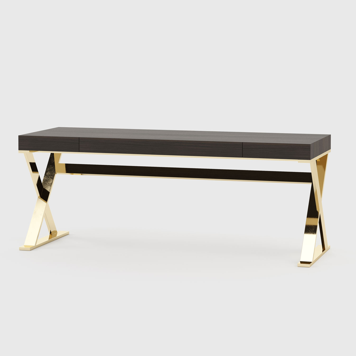
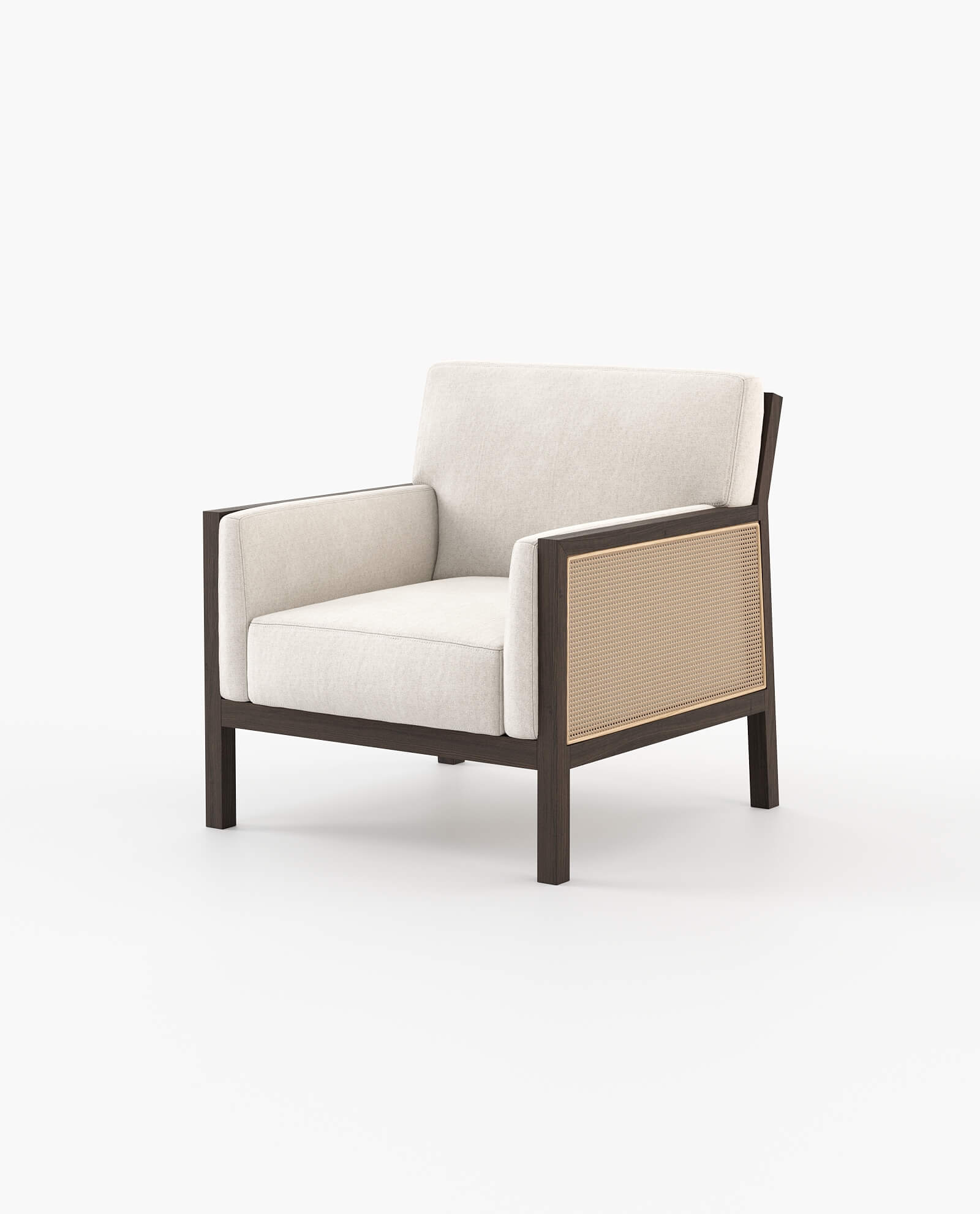
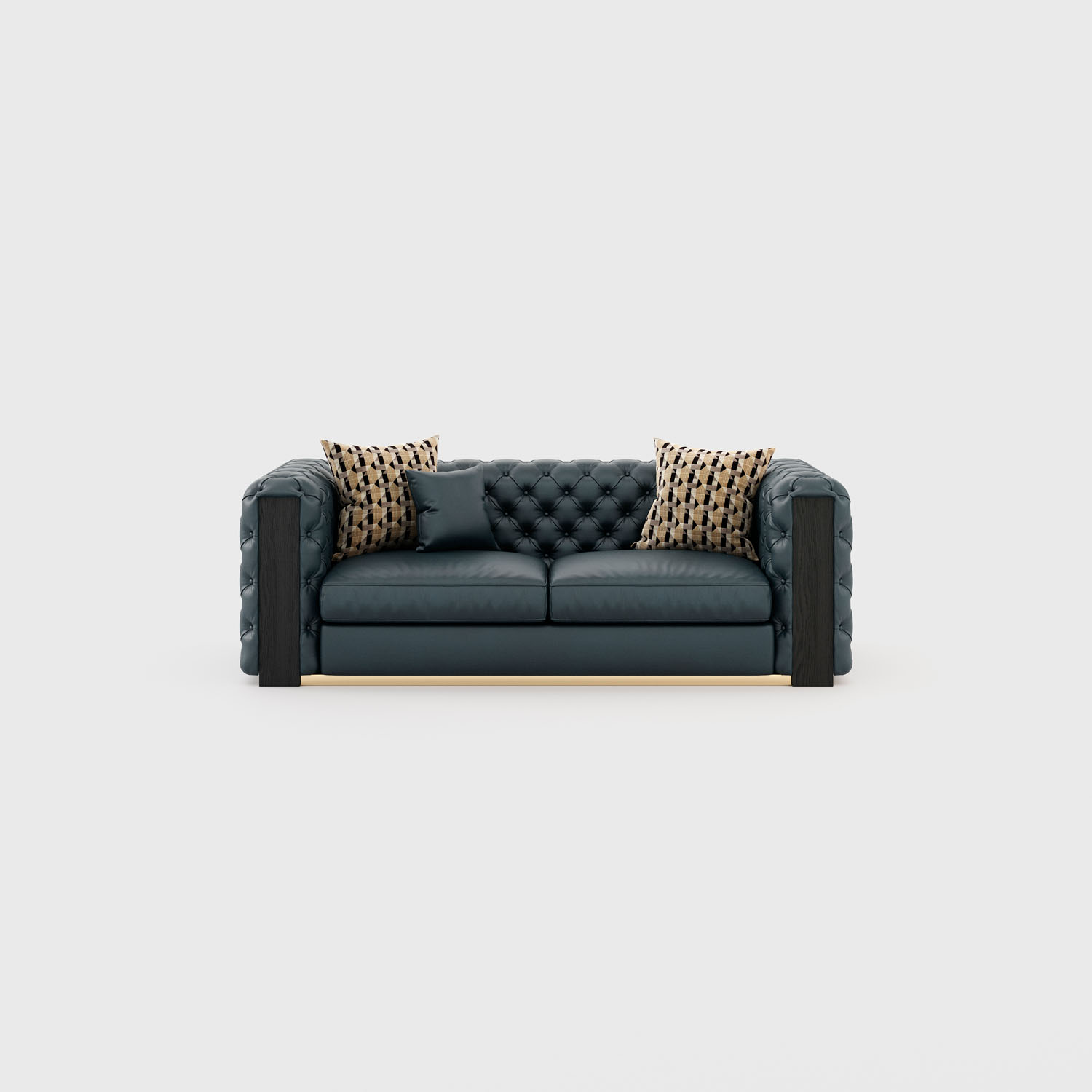
Layered Brown
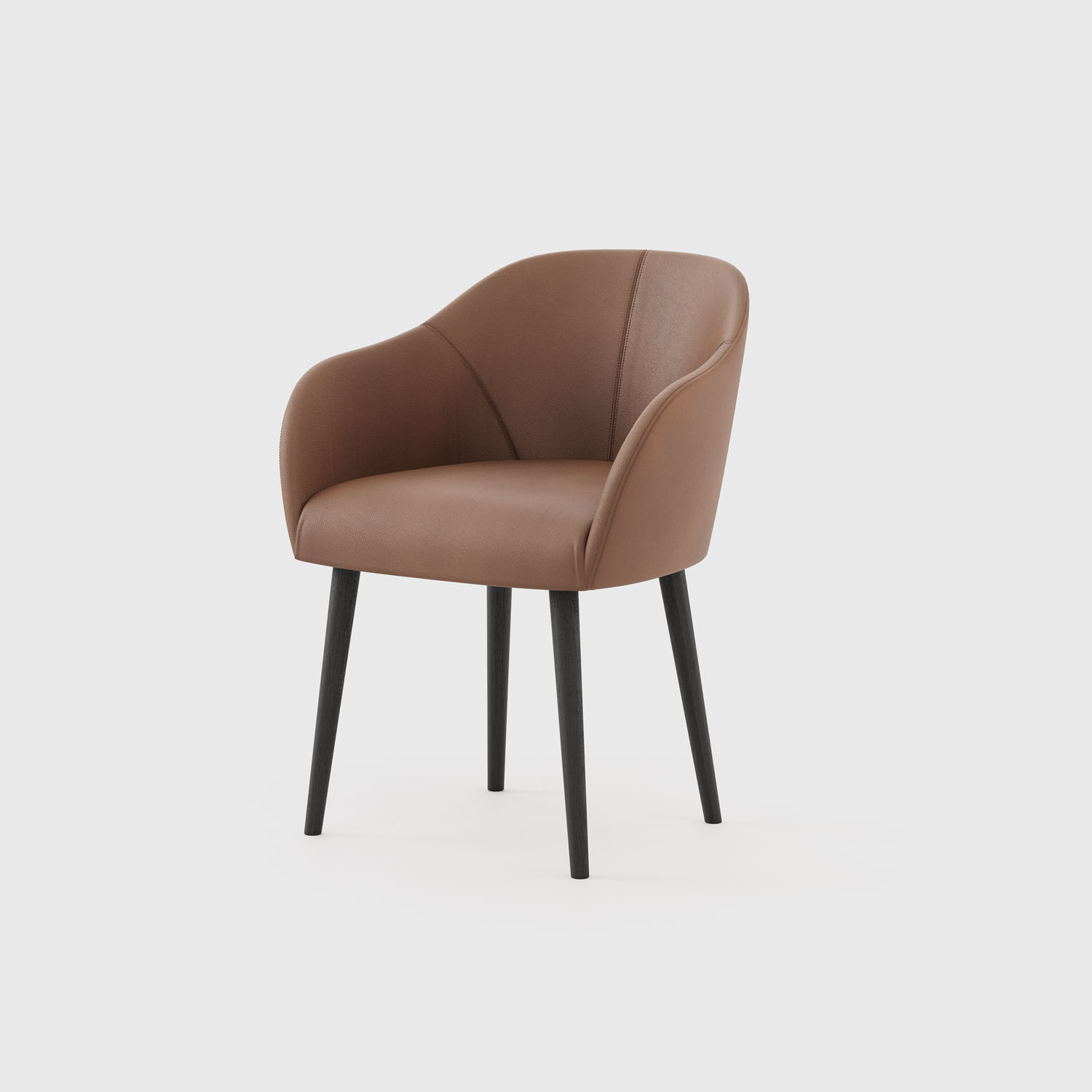
Brown hues continue to experience a resurgence, with layering tones creating a vintage-inspired mood. From the warm reddish-brown of Redwood to the deeper Coco de Mer, these rich hues provide a retro revival with a cosy, luxurious edge. The importance of brown as a directional colour is due to the versatility of hues across a diverse range materials, from natural woods and lived-in leathers to plush fabrics. Choose classic colour pairings such as oranges, blues, reds and yellows to reinterpret the style of the past for the future.

Tips: Varying tones of brown will enhance the revival of heritage and retro designs as they increase in importance
Give interiors a warm and cosy sensibility with reddish hues and natural brown tones
Explore classic colour combinations and pairings to deliver a retro aesthetic and rich vibrancy

Sunbaked Orange
The direction for earthy and sun-drenched colour combinations continues to grow, with timeless terracotta tones and orange tints such as Furnace delivering a rich intensity on everyday products. These rust-inspired hues offer calm, comfort and sensory tactility when paired with warm neutrals. There is a solid, sophisticated quality to these burnished shades, which works well on all scales. This versatile colour has transseasonal appeal and complements both warm and cool tones. Porous finishes remain key as a connection to craft and nature

Tips: Emphasise the natural earthiness of the tone with lived-in and dry, rougher fibres to create welcoming and comforting spaces.
Celebrate contrasts with glazed and unglazed finishes or by layering a variety of hues
Investigate surface texture and the warmth that reflects the true properties of terracotta

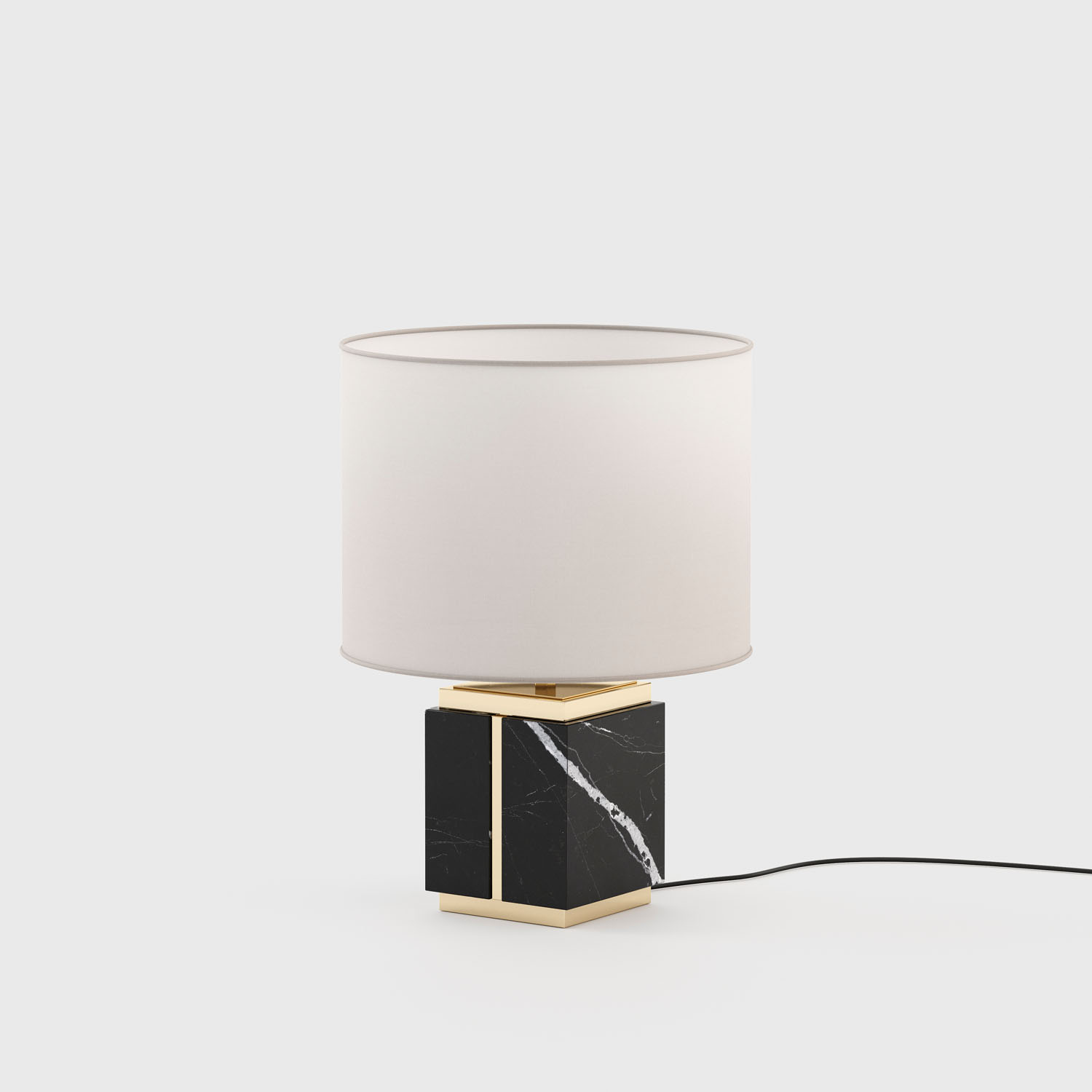
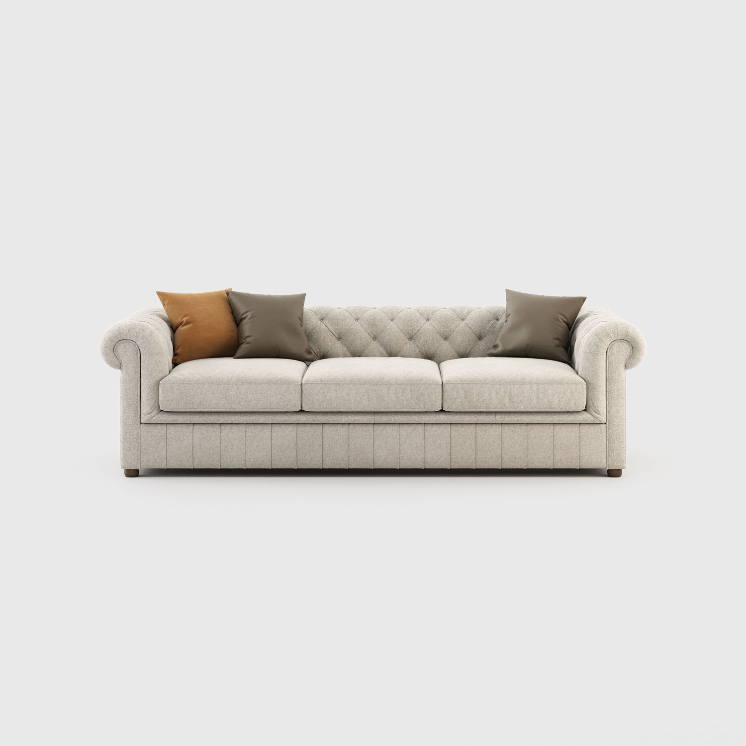
Warm Neutrals
Soft, warm and tactile neutrals play a central role, confirming the growing relevance of these tones, which bring a sense of calm, light and serenity to spaces. Creams, muted blush pinks and off-white shades appear genderless across products and offer restorative appeal. These relaxed tonal pairings evoke a gentle pace, with mindful living and domestic cosy styling, inviting a tactile feel. In the home, these versatile shades help to balance colour intensity and reduce the apparent weight of products. Incorporate these shades on matte and semi-shine surface treatments such as ceramics and soft goods.

Tips: Introduce small repeats and fine patterns to enliven the surface of hard and soft pieces
Choose tone-on-tone pairings to offer a harmonious and soothing approach
Keep shapes simple and informal.

Clean Tones
White, unbleached and icicle tones return with renewed interest, offering respite from stronger colours and embracing the growing importance of sustainability, health and cleanliness in the wake of the coronavirus pandemic. As people spend more time at home, soothing interiors will provide a sense of security, so the focus on maintaining hygiene brings these colours front and centre in consumers’ minds. Unbleached and undyed and imperfect whites tap into the desire for a more sustainable approach to colour creation.
Tips: Adopt minimalist and pared-back aesthetics to help communicate a feeling of cleanliness and freshness
Create a sense of relaxation and softness with simple tactile finishes, casual textures and surface decoration
Add subtle colour and accents to enliven spaces

Perfect match:

See our catalogue to get more ideas!
